Seabank
<2020>
Introduction
Seabank is a digital banking arm of Sea Ltd that came about from an M&A deal between Shopee and Bank BKE Indonesia. This project is a speculative exercise stemming from an internal branding project to explore the possibilities of brand direction.
Seabank is a digital banking arm of Sea Ltd that came about from an M&A deal between Shopee and Bank BKE Indonesia. This project is a speculative exercise stemming from an internal branding project to explore the possibilities of brand direction.


The proposed brand direction embraces a bold, expressive energy, targeting digital natives with confidence and relevance. Visually, it draws from Gen Z culture — trend-conscious, socially fluent, and unapologetically vibrant — while maintaining a grounded sense of trust and polish expected of a financial institution.
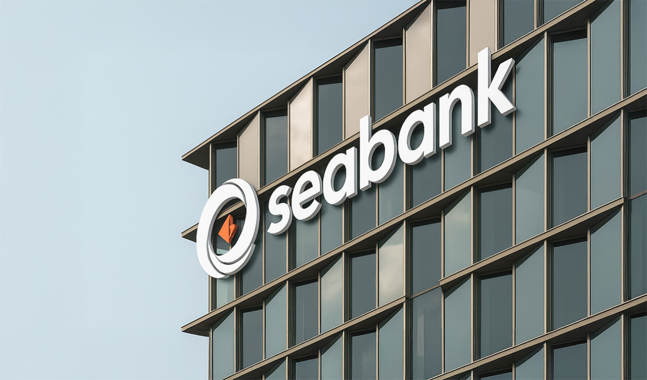
Seabank positions itself at the intersection of convenience, technology, and youth culture. Designed to serve digital-first users across Indonesia, its identity needed to convey both immediacy and trust. The logo captures this balance — expressive in spirit, grounded in form.

The outer shape of the logo takes inspiration from Sea Group’s corporate mark — a stylized wave that evokes motion, continuity, and digital liquidity. This reference roots Seabank within the larger brand ecosystem while expressing adaptability and flow, both essential traits for a digital-first financial platform.
Nested at the core is a diamond-like form, symbolizing value, stored currency, and the role of Seabank as a modern steward of finance. It reflects a treasury in abstraction — a secure digital token at the heart of movement and exchange. Colored in Shopee’s signature orange, the mark also serves as a quiet nod to Seabank’s strategic role within Sea Group’s wider ecosystem.


The brand was developed with a deep understanding of the Indonesian fintech landscape and Gen Z user behaviors. Rather than default to surface-level design trends, the approach prioritized resonance: how the brand feels, speaks, and behaves within real-life usage. Extensive audience research informed the tone, color choices, and touchpoints — resulting in a brand identity built not just to look appealing, but to be culturally and functionally relevant.
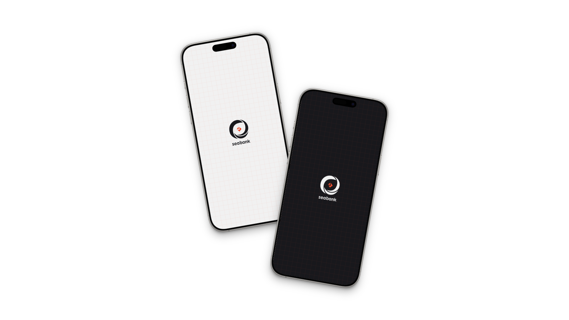
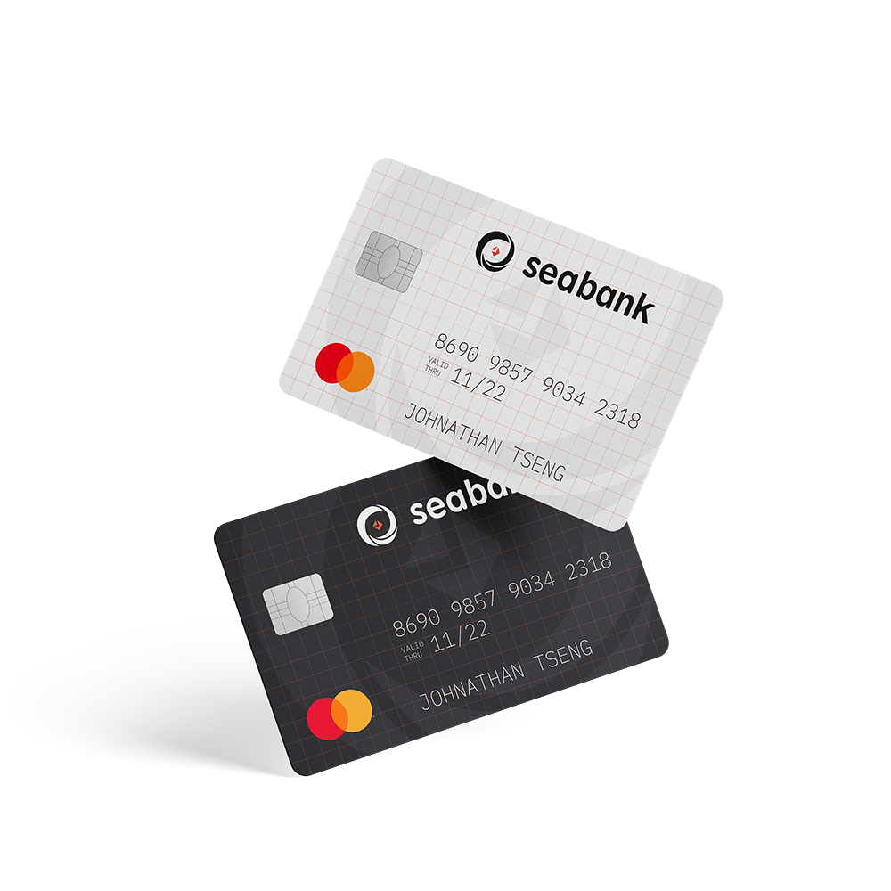
The primary brand color draws from Shopee’s signature orange, creating seamless alignment across Sea Group’s ecosystem. A supporting palette of off-white, charcoal grey, and black provides balance, offering flexibility across both light and dark environments.
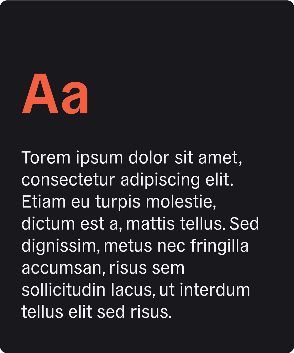

General Grotesque was selected as the brand’s typeface for its contemporary geometry, legibility, and character. It balances modern digital utility with a touch of editorial sharpness — appropriate for both interface design and brand communications.


While the brand lives primarily in digital formats, a visual system for physical stationery was developed to demonstrate adaptability. The applications remain clean, structured, and restrained — extending the identity into print with clarity and coherence.
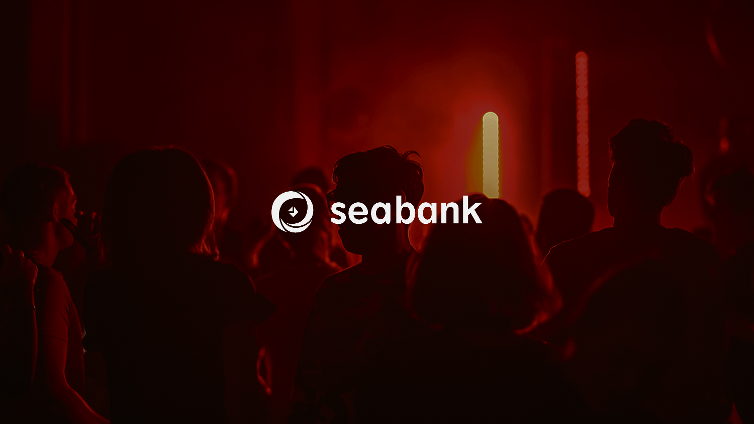
The advertising visuals extend Seabank’s identity across campaign touchpoints — bold layouts, punchy copy, and striking color usage ensure high visibility in digital and urban contexts. These mockups demonstrate how the brand holds a strong, recognizable voice across formats, from mobile banners to street posters, all while remaining true to its audience-first strategy.
The advertising visuals extend Seabank’s identity across campaign touchpoints — bold layouts, punchy copy, and striking color usage ensure high visibility in digital and urban contexts. These mockups demonstrate how the brand holds a strong, recognizable voice across formats, from mobile banners to street posters, all while remaining true to its audience-first strategy.


Advertising concepts further define Seabank’s voice: energetic, personable, and audience-aware. The campaign visuals deliver clear value messaging with youthful boldness — positioning Seabank not only as a product, but as a relatable digital lifestyle brand.


This speculative rebrand was presented to the design leadership at Shopee during the internship wrap-up, where it was well received for its insight into the Indonesian market and its creative alignment with younger users. While not an official direction, the project served as an imaginative proposal for how Seabank could evolve with its audience in mind.

Reuters Staff. “Indonesian Banking Regulator Says Sea Group’s Shopee Acquires Bank BKE.” Reuters, 18 Feb. 2021, URL. Accessed 27 June 2025.
Silviana, Cindy. “Sea Group Firms up Digital Payments Play in Indonesia with Bank BKE Acquisition.” DealStreetAsia, 13 Jan. 2021, URL. Accessed 29 June 2025.
Footnote
︎ The logomark for this brand was developed as a collaborative effort within the Brand Design team. Adaptation and application of the branding visuals across various touchpoints were carried out independently as part of this project.
︎ Select elements of this page, including portions of the rationale and a small number of visual mockups, were developed with the assistance of generative AI tools. All design concepts, direction, and final decisions reflect my own work and creative intent.